29 February 2012

Raindrops Keep Falling on My Nails! - Nail Art Contest Entry


This mani is based on an idea I've had in my mani-spiration book for a while now.  The motivation for finally getting around to doing it is Chalkboard Nails' nail art contest found here.  This is my first time entering a contest.  While I don't expect to win (way too much talent out there!), I'm just proud of myself for getting up the courage to enter!  The rules were that you could only use the polish brush and a dotting tool (or something dotting tool-ish).  I don't have an actual dotting tool, so I used this stylus I have from when I used to do ceramics.


And on to the mani! My idea was to have it look as though rain was "filling" my nails with water.  I used SH Double Duty as a base followed by two coats of OPI's Alpine Snow.  The raindrops and last nail are PP It's All About Blue and it's all topped with SV.  My improvised dotting tool's ends are two different sizes, but both are actually quite small. For smaller raindrops, I used the dotting tool alone.  For the fatter raindrops, I ended up having to use the polish brush to drop a dot of polish and then use my tool to pull a tail.  Since I wanted the nails to look as though water was filling up and sloshing around, I just free-handed uneven tips.  What do you think?


My Daughter's First Dotticure!

My daughter wanted me to paint her nails, which is always a huge task since she has the tiniest fingers.  She is 7 years old, but is actually quite small for her age.  So I decided to do a dotticure for her.  I used SH Double Duty as a base.  Then I did two coats of Maybelline's Prompt Petals.  Next, I added small and large dots using OPI's Alpine Snow.  I added purple dots on top of the larger white ones using Rimmel's Climax, except on her accent nail.  For the accent nails, I added a flower nail art to the larger white dot.  I then topped them off with a coat of SV.  She loved them and actually managed to keep them in good shape for a couple of days!  These pics were (obviously) taken before clean-up because she was too excited for me to take pictures of her nails using my "nail picture box."


28 February 2012

Tips, Tricks, and Tutorials Tuesday - Tiered Shelves for Nail Polish Stash!

Hello and welcome to another 3T Tuesday!  So I have been keeping my stash in a drawer in the bathroom.  That was just fine and dandy, until my stash more than doubled in a couple of months!  I can probably manage to keep everything in the drawer, but it's awfully crowded in there.  Plus, I hate looking down into a drawer.  It makes it impossible to see all of the colors and I have to do the pluck and hunt...no fun.  I started looking for either a rack or tiered shelves that I could hang on the wall.  I really like the idea of being able to actually see the front of all the bottles to pick a color.  When my search turned up nothing that I was happy about, I set out to build my own.

Here is the finished product!


Follow the link for a tutorial on how to build these!

27 February 2012

I'm Swatchin' You - New York Color East Village and a Layering Experiment

Happy Monday! I have an electrified sheer blue to shock you into gear for the week.  This next swatch is from NYC's In a New York Color Minute line.  It's called East Village (love that!), so you know it has sass!  The color is a shimmery sheer teal that makes me think of mermaids.  It would look gorgeous over a light base.  But of course, since I'm swatching, I wanted you to see it in all of it's natural glory!  Easy application with a decent brush.


  SH Double Duty and SH Insta-Dri for base and top.

Update: I got some recommendations from some folks over at MUA for layering ideas with this color.  The suggestions were:
Jelly sandwich with a black glitter
Layer over pale yellow
Layer over navy
Layer over OPI Be a Dahlia, Won't You

I found that I did not have a black glitter, so I used the darkest glitter I had in a clear base, which was Sinful's Call You Later.  (Mental note: add a black glitter to stash!)  For the pale yellow, I used Sinful's Unicorn.  The navy I used, which was the only "straight"' navy I had, was ChG's Frostbite.  And since I did not have the OPI color, the closest color I had was Icing's Cherry Blossom.  I decided to add an idea of my own.  For some reason, I thought this color would look great with black lace.  So I painted my thumb with OPI's Alpine Snow and topped it with East Village.  Then I used some black lace I had to add a lace tip.

On a side note, I tried using Maybelline's Express Finish top coat.  I have to say it was crap-tastic.  It did absolutely nothing for drying my nail polish quickly.  I think I bought this years ago to use with my daughter's manis when I wanted a cheap QDTC.  It does apply well, so I will just keep it on hand as a regular top coat.  Enjoy the experimental pics!  Oh, and since I knew this would come off as quickly as it went on, I was not too careful with application and didn't bother with clean up.  Deal with it! :o)

L to R: NYC East Village, OPI Alpine Snow, Sinful Call You Later, Sinful Unicorn, ChG Frostbite, Icing Cherry Blossom

L to R: Jelly Sandwich with Call You Later, layered over Unicorn, layered over Frostbite, layered over Cherry Blossom


Layered over Alpine Snow with black lace tip

24 February 2012

Feature Friday - Cherry-Tipped Marshmallows

And then there were 18!  Thank you so much for being here!!!

Since I've been taking this stroll down Colorama memory lane, I decided to show the mani I talked about using Marshmallow Glaze with Cherry Tips.  I did this one two different ways to show you guys.  Let me know which you like better!  And if I didn't tell you when I swatched Marshmallow Glaze, let me tell you now.  It goes on like a freakin' dream!  Great, even coverage and I actually like their brush.  It's a little wider than I usually go for, but it works well!

I started with a base coat of SH Double Duty.  For the first mani, I then painted on two coats of Colorama's Marshmallow Glaze and followed it up with a coat of SV.  Then I taped off my tips and painted on Colorama's Cherry Tips.  Finished this off with a coat of SV.  Painting the tips last allows the red to really pop.


Then, I did the mani again.  But this time, I painted my tips red immediately following the base coat and topped them with SV.  And then I painted two coats of Marshmallow Glaze over the whole nail, including the tips.  This results in a muted tip that almost looks like a frosted pink.  This is a little more conservative with less pop.  It kind of unifies the whole mani.  What do you think?  Which do you like better?


Have a fantabulous weekend everyone!

23 February 2012

I'm Swatchin' You - Colorama Plum Juicy Tips

Happy Thursday!  Here is my last Colorama color.  This one is another that was meant to be for tips.  But of course, I figured I could do one better...a whole mani of this awesome color!  This is a beautiful and playful purple with lots o' glittery goodness.  It's called Plum Juicy Tips and it is juicy!  This is another one of those colors that I just hate to take off!  I'm seeing a cool mani pairing this with black in the future.  Off to jot down some ideas!  What would you do with this color?


SH Double Duty and SH Insta-Dri as base and top.


22 February 2012

I'm Swatchin' You - Colorama Spiced Tea

Good morning, sweet people!  Here is another Colorama color.  This one is a sweet little color called Spiced Tea.  It's got a nude-y beige color with a touch of sparkle and hint of pink.  This is another great base for a french.  As with the other Colorama colors I've used, it goes on very smooth and even.  I really want to layer this color over a black someday, too.  Let me go jot that down...


SH Double Duty and SH Insta-Dri as base and top.

21 February 2012

Tips, Tricks, and Tutorials Tuesday - Lightbox - And a Mardi Gras Mani!

First of all...hello and welcome!  17 and I'm so excited that each and every one of you are here!

If you've noticed, I'm trying to come up with different things to bring you throughout the week.  I have Feature Friday, which is the "experimental mani of the week."  Sometimes they are great, other times, not so much.  And now Tips, Tricks, and Tutorials Tuesday.  I would like to use these posts to tell you about things I've tried, made, etc.  Maybe they'll be great ideas and maybe not so much.  That's where the adventure comes in!

So today, I'm bringing you my tutorial for making a lightbox.  There are many different variations out there.  As a former, semi-pro photographer, I found this to work the best for me.  Also, bear in mind that my experience in photography was in 35mm film.  My digital camera is actually a hand-me-down that's quite old and does not have a very good lens.

First, why a lightbox?  A lightbox allows you to take photos of objects (or manis) with a continuous, uncluttered background.  It also helps to minimize glares and distracting shadows.  The indirect or diffused lighting also avoids hot spots that usually result when you take photos using an on-camera flash (especially fixed flashes on point-and-shoot cameras).

For my lightbox, I decided to use as many materials as possible that I already had on hand.  Plus, I did not want to make it out of foam core since I move a lot and it would be destroyed during the next move.  You can absolutely make this out of white foam core (available at any craft store) to save some work.  I used a cardboard box I had left over from the holidays.  That's my sweet Hubberoo doing the cutting for me!

I wanted my lightbox to be square, so the width of my existing box dictated the finished size.  Since the box was 15" wide, I (or should I say, the Hubberoo) cut it down to be 15" long.  He just cut out the back and left the sides.  The sides were then able to be folded up to create the new bottom (shown below).

Some lightboxes have holes cut in the sides with the holes covered with tissue paper.  Lights would then be positioned outside the box, as in the diagram below.


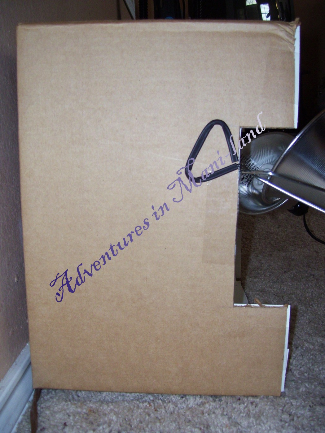
I did not want to use this setup because I would prefer to fill the box with indirect light instead of using a diffused light.  It can be difficult to diffuse the light effectively to avoid hot spots, glare, and shadows.  So I cut two notches from each side.  The notches were approximately 2" x 7".  The purpose of the notches is to get the lights to be slightly recessed into the box to effectively bounce the light off the top of the box and down onto the object(s).


Next, I lined the box with matte white poster board (glossy poster board will cause glares).  I cut the  white poster board to fit both of the sides and the top of the box.  I attached the pieces using double sided tape.  Then I measured the back and bottom of the box and cut one piece of poster board to cover both surfaces.  I did this to create a continuous piece of poster board to serve as a backdrop with no seams or creases.


Now all that's left to do is attach your lighting!  I picked up two work lights from a hardware store.  I also grabbed two bulbs.  I will tell you to save your money on the bulbs!  All you need are low watt (mine are 60 watt equivalent) daylight bulbs.  I paid about $6.00 for a package with two bulbs.  Some people will tell you to splurge on more expensive bulbs.  This is absolutely not necessary unless you are using a very expensive, high-end camera.  Most of the point-and-shoot digital cameras are not sophisticated enough to pick up small deficiencies in regular daylight bulbs.


I attached my lights to the notches in the sides of the box and angled them up to the top of the box.  You may have to play with the angles a bit to find what works best.  Take some test shots and look for glares or shadows and adjust your lights as needed.  Here is what mine look like:

Lights off
Lights on
And the results!


Hope this helps you!  And remember, this is what worked best for me.  There are tons of options for building a lightbox.  Go with what works and what is easiest for you to do.  If you made a lightbox recently, let me know in the comments so I can check it out!

And since it's Fat Tuesday, I am throwing in a quick Mardi Gras mani!  I used Revlon's Not So Blueberry as the base.  Then I added SH Insta-Dri in Jumpin' Jade and ChG Champagne Bubbles on my accent nail using tape.  Topped it all with SV.  Enjoy!


20 February 2012

I'm Swatchin' You - Colorama Cherry Tips

Good morning and happy Monday!  Hopefully, you have the day off and are enjoying a relaxing cup o' coffee in your jammies as you read this.  Here is the color I talked about on Friday.  It's from Maybelline's Colorama line and it's called Cherry Tips.  I bought it specifically to go with the Marshmallow Glaze in a french, and they do look wonderful together.  I'll do that french sometime soon and post for you.

This is a great, sweet red.  It's vibrant without being obnoxious.  It does not go on sheer, but it has a slightly sheer look to it and it sparkles gently in the sun.  It goes on smooth and even and looks great!


SH Double Duty and SH Insta-Dri for base and top.


17 February 2012

Feature Friday: Marbled Mani

Hi everyone!  I think I've mentioned before that I get some of my inspiration for manis from artwork I've done and even walls I've painted.  This mani is an idea I've had written in my little mani-spiration notebook for a while now and I got the idea from walls I've painted!  Those walls actually inspired two ideas.  Maybe I'll try the other one for next week's Feature Friday.

Anyway, I've painted walls with a flat white or off-white base and then used cheesecloth to rub on a gray to get the look of stone.  Then, using black paint and a small paintbrush, I painted on veins.  To finish, cover the walls in a clear glossy finish.  So I wondered how this technique would work on nails.  It definitely takes some getting used to using polish as a medium instead of paint.  But I think it's okay for a first attempt!  And the name is not to be confused with marbling nails.  This is not a water marbling.

I started with one coat of SH Double Duty as a base.  Then I painted on two coats of OPI's Alpine Snow and topped it with one coat of Essie's Matte About You.  You will want to wait a while to make sure the polish is dry and won't smudge with some pressure.


Next, I cut a small piece of cheesecloth and painted on some SH Xtreme Wear Wet Cement polish on the tip of the folded cheesecloth.  I very lightly and quickly rubbed it on the nail.  You have to work quickly and try to make it uneven, with more polish is some spots and less in others.  If you rub it around too much, the polish will start to dry and clump up.  You also want to try to get as close as possible to the edges to avoid a white outline.


Then, I used ChG's Liquid Leather to paint on veins.  I diluted the polish to bring down the intensity of the black.  Using a piece of tape as a palette (very high tech, BTW), I put down a drop of polish.  Then I grabbed a very fine paintbrush and loaded it with nail polish thinner.  Then I grabbed a bit of polish and rubbed in around to the load the brush with diluted polish and painted on some veins.  Here is a pic of my very sophisticated palette and the cheesecloth I used.


I did not paint a vein on every nail.  I left one or two plain.  On my left hand (shown) I left my accent nail plain.  Then I topped it with SV.  Not perfect, but not horrible for a first attempt!  I'll try to do my other idea for next weeks Feature Friday.  Thanks for looking!!!